Painting with a Mixed (Chromatic) Black

Chromatic black is a mixed paint color that looks black but doesn't contain any black pigment in it. None of the pigments in a chromatic black mix have a PBk (Pigment Black) Color Index. Instead, a chromatic black is created by mixing dark versions of other colors, typically a red and green or blue and red.
Given how easy it is to squeeze paint out of a tube, why would you bother mixing up a substitute for black? It's partly the fault of the Impressionists (such as Renoir and Monet) and statements they made about shadows not being black and how it should never be used (although most of them did at some stage or other).
It's partly because using too much black to darken colors easily results in muddy colors. This is especially true amongst beginners, so some art tutors find it easiest to ban black altogether. It's partly because black can be a very flat and dull color. And it's partly because a chromatic black is a more complex, interesting color, with a subtlety that straight black lacks.
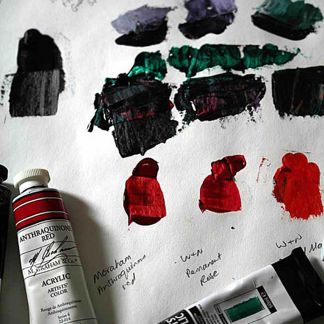
What pigments you use to create a chromatic black is not a question of right or wrong colors, but experimenting with various options until you find a combination you like. Start by mixing in equal proportions, but be sure to also try mixes that aren't equal, so you've a 'black' that leans towards a color.
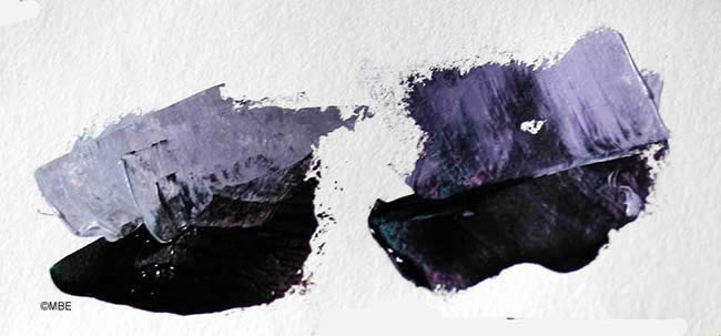
A quick way to see whether your chromatic black has a bias towards one color or another, is to mix a little into some white. You'll immediately see if the grey has a pink (or green, or something) tinge to it, or not. Alternatively, scrap a little bit smooth with a painting knife to reveal the undertone.
Ready-Made Chromatic Black:
If you don't like mixing colors and would rather buy a tube of chromatic black, as far as I know Gamblin is the only paint company that sells one. Gamblin makes an oil chromatic black using PG36 and PV19 (phthalo green and quinacridone red). (Buy Direct)
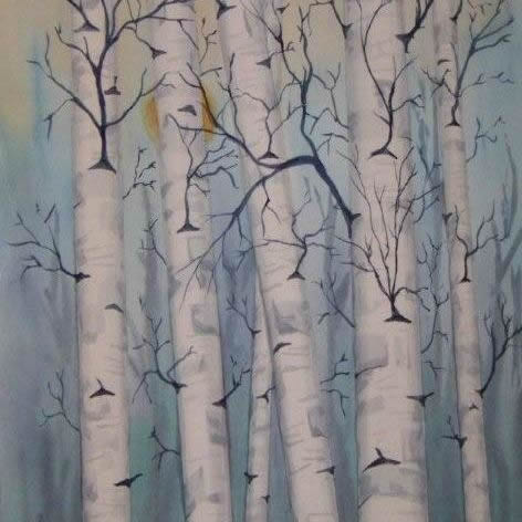
In the painting shown here, artist Jön Otterson has used chromatic black for shading and texture, as well as blended with other colors to darken or gray them. He said: "This is my favorite way to use chromatic black." It's not hard to see why: the colors harmonize beautifully, there's a color unity across the composition, and a range of tones.
Painting tip: Jön used drafting tape (similar to masking tape) for blocking out the tree trunks while he painted the background. If you want straight lines, tape is easier than masking fluid. (More on Masking with Tape.)
