Set Up the Perfect Watercolor Color Palette

New paint, who dis? Anyone who's ever tried watercolor has quickly learned that watercolor shades can look a lot different in the package than on the paper. That's why swatching your go-to colors is like the equivalent of adding friends to your contact list ... when you need 'em, you can quickly call 'em up. Here's how to get started creating your palette:
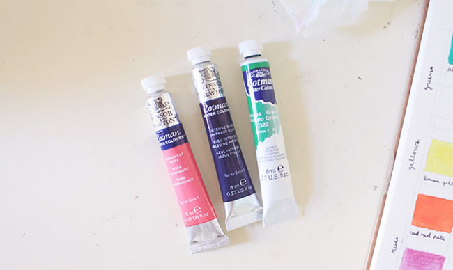
You can paint a palette with whatever colors you like or have on hand. But if you're just building your collection, this is a great beginner's breakdown:
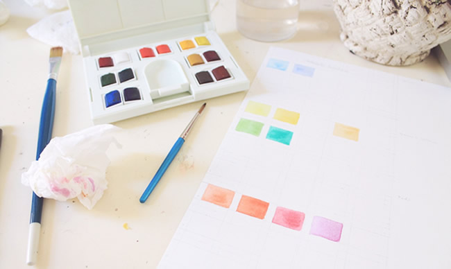
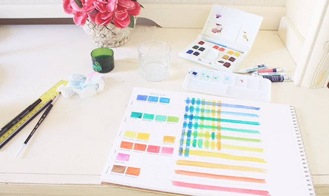
You can swatch each color by doing simple brushstrokes on the page, which is super quick and easy. But if you want to get fancy, draw out a grid with a rectangle for each color. Then, plan out where to place each shade moving from coolest to warmest (blues, greens, yellows, reds and browns). Consider leaving some extra spaces in there for when you add new colors, since this is something you're going to want to keep for reference.
Once you have all your colors swatched in one place, you can easily see exactly what you're getting into each time you dip your brush. A palette also helps you compare things like intensity, value, transparency, and temperature. The end game? A better painting.
